My Bitcoin Buy/Sell Indicator
Is It A Good Time To Buy Bitcoin?
What's this chart?
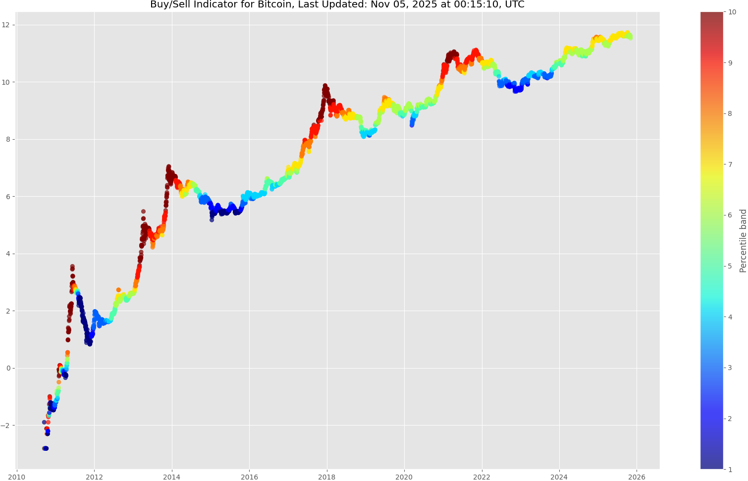
This chart is based on the Power Law Oscillator model for Bitcoin, to which I made some tweaks in order to make it more accurate based on recent price action. I have written an in-depth explanation about the model and how it works, and how you could code it yourself. If you're interested in diving deeper, give it a read!This image is updated every day at midnight UTC.
.getTime()})
How should you interpret this?
The oscillator (a value that lies between -1 and 1) can be used as a tool that helps us understand if Bitcoin's price is too high or too low compared to its historical patterns. Think of it like a gauge. It looks at Bitcoin's current price and compares it to where it's expected to be "on average" based on past data. When the gauge is in the red zone, it might mean Bitcoin is getting overvalued, and selling could be a good idea. But when it's in the blue zone, it might be a good time to buy because Bitcoin could be undervalued.The plot above is a scatterplot of Bitcoin's price color-coded on which percentile the oscillator value belongs to at any given point in time (you may want to read the article linked above). Blue regions are closer to the 10th percentile, while red regions are closer to the 90th percentile.
Too long, didn't read?

Pretty simple. Buy when dark blue, sell when dark red.
It's important to note that the oscillator is not flawless and should not be the sole basis for investment decisions (don't sue me!)
